How to use
Muffin Live Builder is visual representation of well known Muffin Builder. It is exactly the same builder but with a different principle of operation. This tool is focused on visual editing in real time. Designing with this editor can be described in 3 simple words: Section, Wrap & Item (Element).
Let's start with the first one, Section. It is a block where you can put Wraps inside. Section itself has many different options like: background (color, image, video), paddings, decorations and much much more. This block and its settings gives you nearly unlimited management possibilites.
Sections options bar is always green color and it appears when you hover over specific section, wrap or element inside.
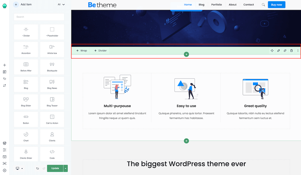
Starting from the left, the bar has the following options:
- +WRAP - this button will add WRAP to the section
- +DIVIDER - this one add a DIVIDER between rows
- + - this icon in a green circle in the middle, adds another section before or after the current section
- Drag - this icon let you drag & drop section anywhere you like but you can also drag it from any other position
- Pencil icon, when clicked it will open a window with all options available for the section
- Clone icon, when clicked it will close that specific section
- Trash icon, when clicked will remove that specific section
- Three dots icon, hovering over it will show all the actions and activities for section like: Hide section, collapse, move up, move down or copy & paste
Let's move on to Wrap. This is representation of container inside section and is grey colour. You can use as many of them inside single section and in any size you like. Different layout variations or its built-in options are only the beginning of what you can achive using wraps.
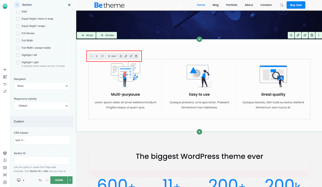
Again, starting from the left side, the options on the wrap bar are as follows:
- + & - these icons let you increase or decrease the size of current wrap
- 1/1 this is the size of actual wrap
- +Item by clicking, the popup with all available elements will appear
- Drag, lets you drag & drop wrap anywhere you like
- Pencil icon, when clicked it will open a window with all options available for that specific wrap. You can also double-click on wrap to perform the edit action
- Clone icon, when clicked it will close that specific wrap
- Trash icon, when clicked will remove that specific wrap
The last one is Item, also called an Element and it has always blue colour of the options bar. To add Item, all you have to do is find the one you need in the bar on the left side and drag & drop in any place in editor. It's that easy. Each element contains a large number of options, thanks to which the limitation in creating various layouts is practically endless.
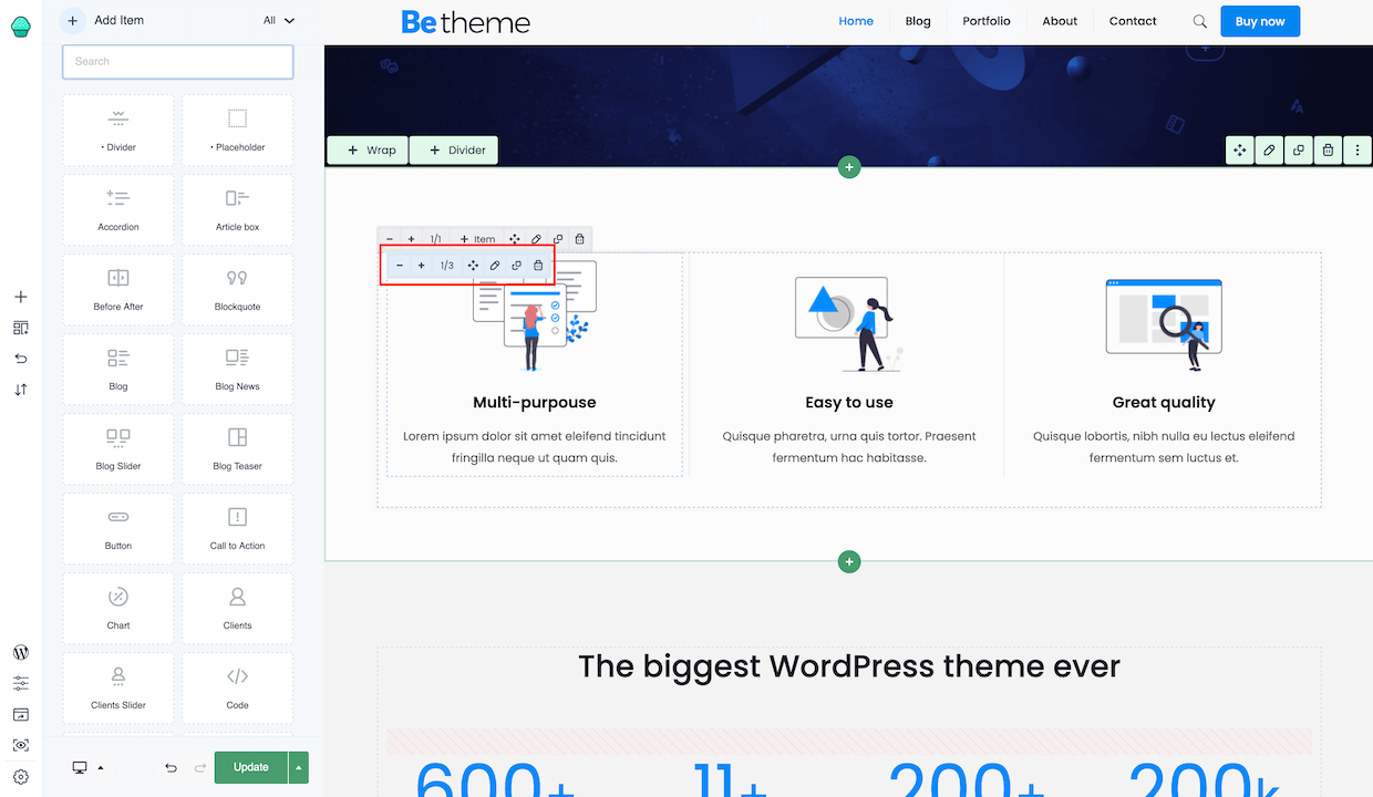
The options on the Item bar are similar to those available for the wrap:
- + & - these icons let you increase or decrease the size of current wrap
- 1/1 this is the size of actual wrap
- Drag, lets you drag & drop wrap anywhere you like
- Pencil icon, when clicked it will open a window with all options available for that specific wrap. You can also double-click on wrap to perform the edit action
- Clone icon, when clicked it will close that specific wrap
- Trash icon, when clicked will remove that specific wrap
Quick Tip!
Right click
For even smoother work, you can use the right click of the mouse to manage the content in the live builder.Quick Tip!