Positioning
With Betheme V26, we have completely rebuilt Sections & Wraps, basing them on CSS Flexbox. It means that spacing and positioning is extremely flexible and layouts can be as advanced as never before.
Below, we will try to explain it in detail using a specific example from one of the pre-built websites.
What is CSS Flexbox?
The Flexbox Layout aims at providing a more efficient way to lay out, align and distribute space among items in a container, even when their size is unknown and/or dynamic.
The main idea behind the flex layout is to give the container the ability to alter its items’ width/height (and order) to best fill the available space (mostly to accommodate to all kind of display devices and screen sizes). A flex container expands items to fill available free space or shrinks them to prevent overflow.
For more details, we recommend to read this article.
In Betheme V26 with BeBuilder (previously known as Muffin Builder), you will find flexbox settings under Positioning tab for Sections & Wraps. These options will help you build layouts that have not been possible until now with great ease.
In Section, you will see three options: Section Content Position, Wraps Vertical Spacing and Horizontal Align.
For Wrap, there are four options: Wrap Position, Wrap Content Position, Elements Vertical Align and Elements Horizontal Align.
Section
First, let's focus on the options for the section.
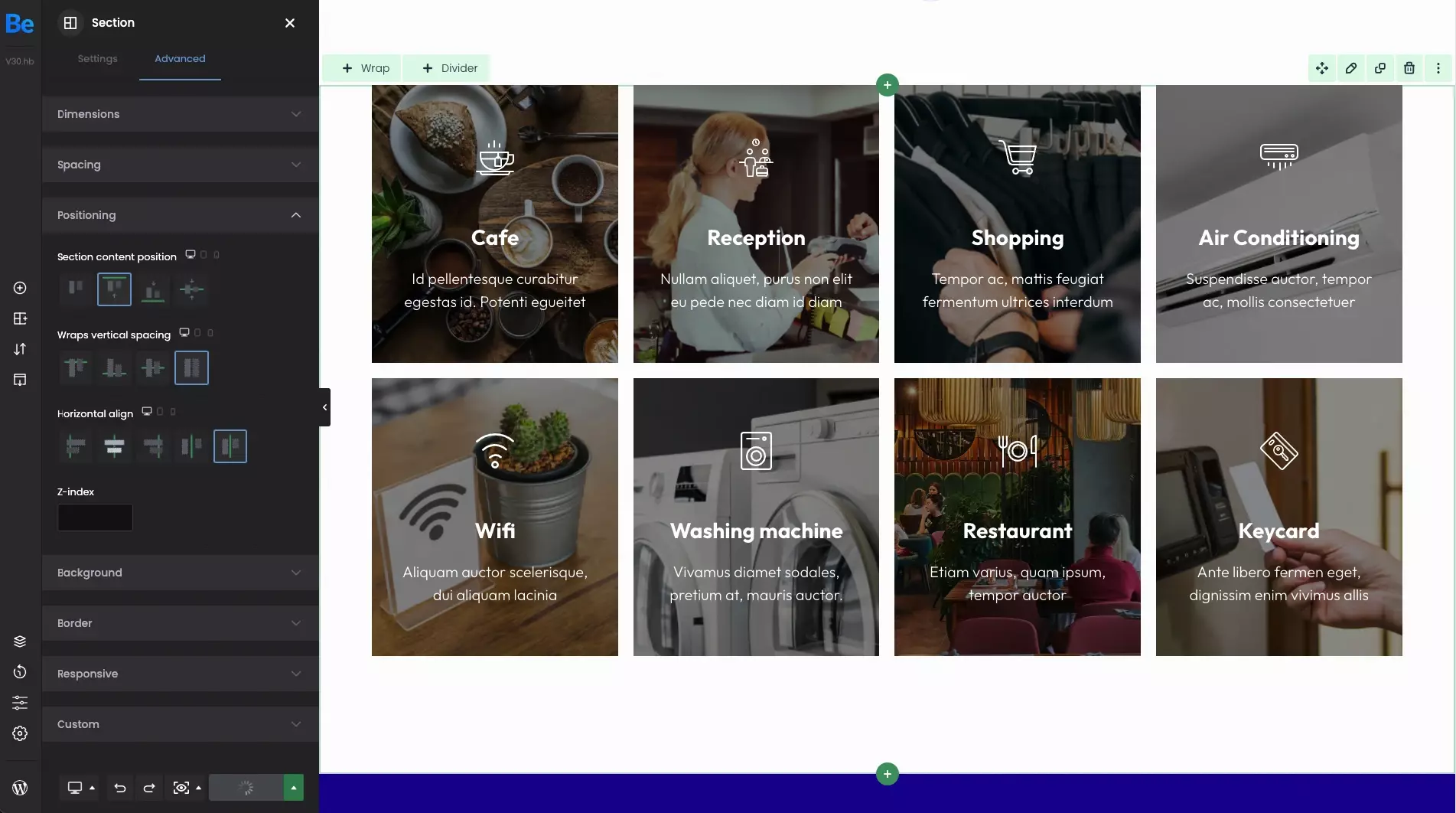
Section content position
To align content inside the section, its height has to be higher than wraps with the content inside. Therefore, if you set custom dimension for the section, you can control position of elements inside with the following options.
- Top This option will stick the content inside to the very top. The green line around indicates the section boundaries.
- Bottom This option will stick the content inside to the very bottom. The green line around indicates the section boundaries.
- Center This option will align the content inside vertically. The green line around indicates the section boundaries.
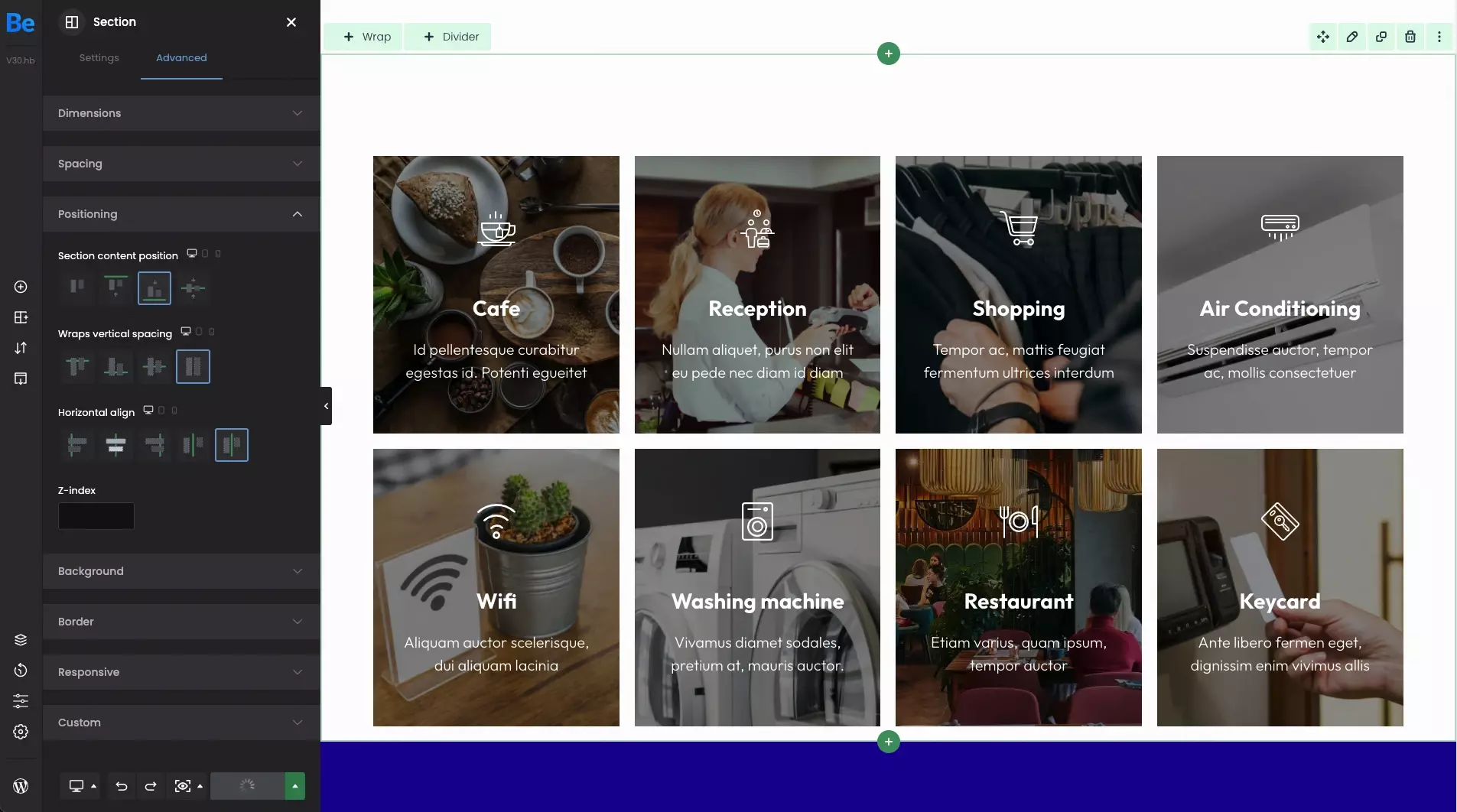
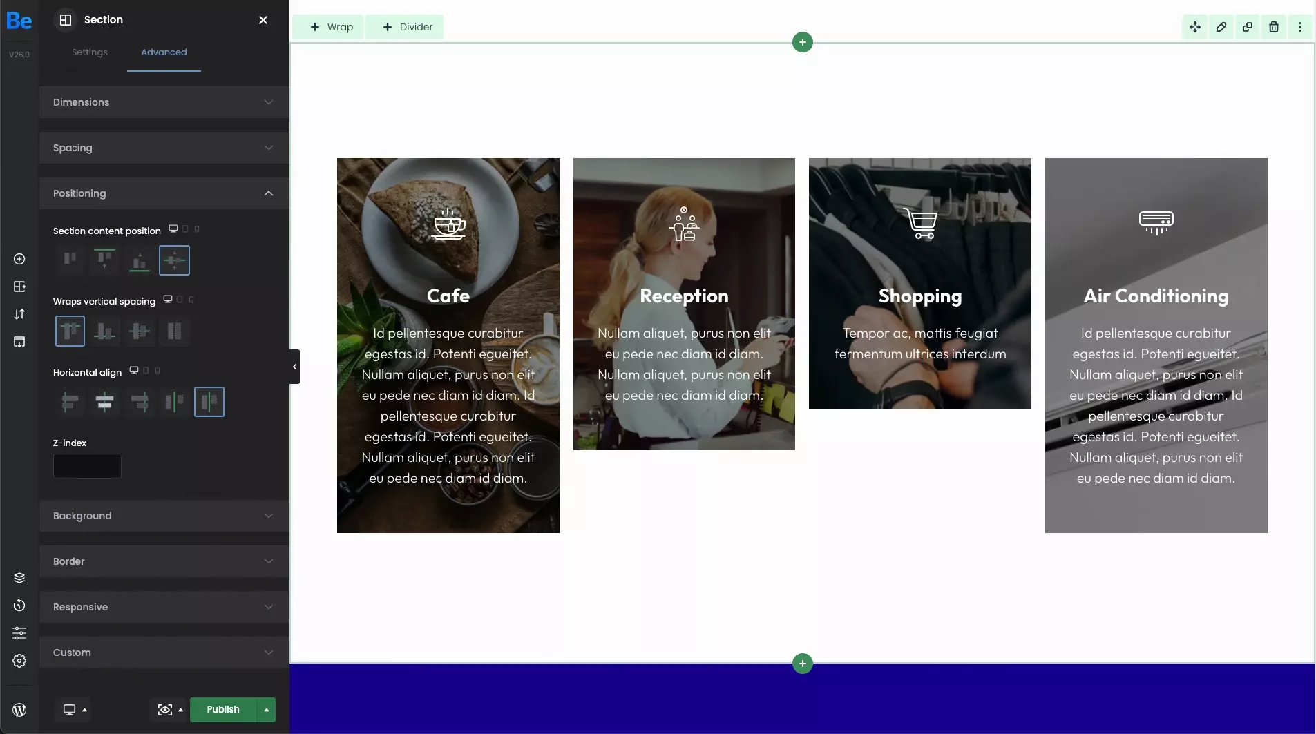
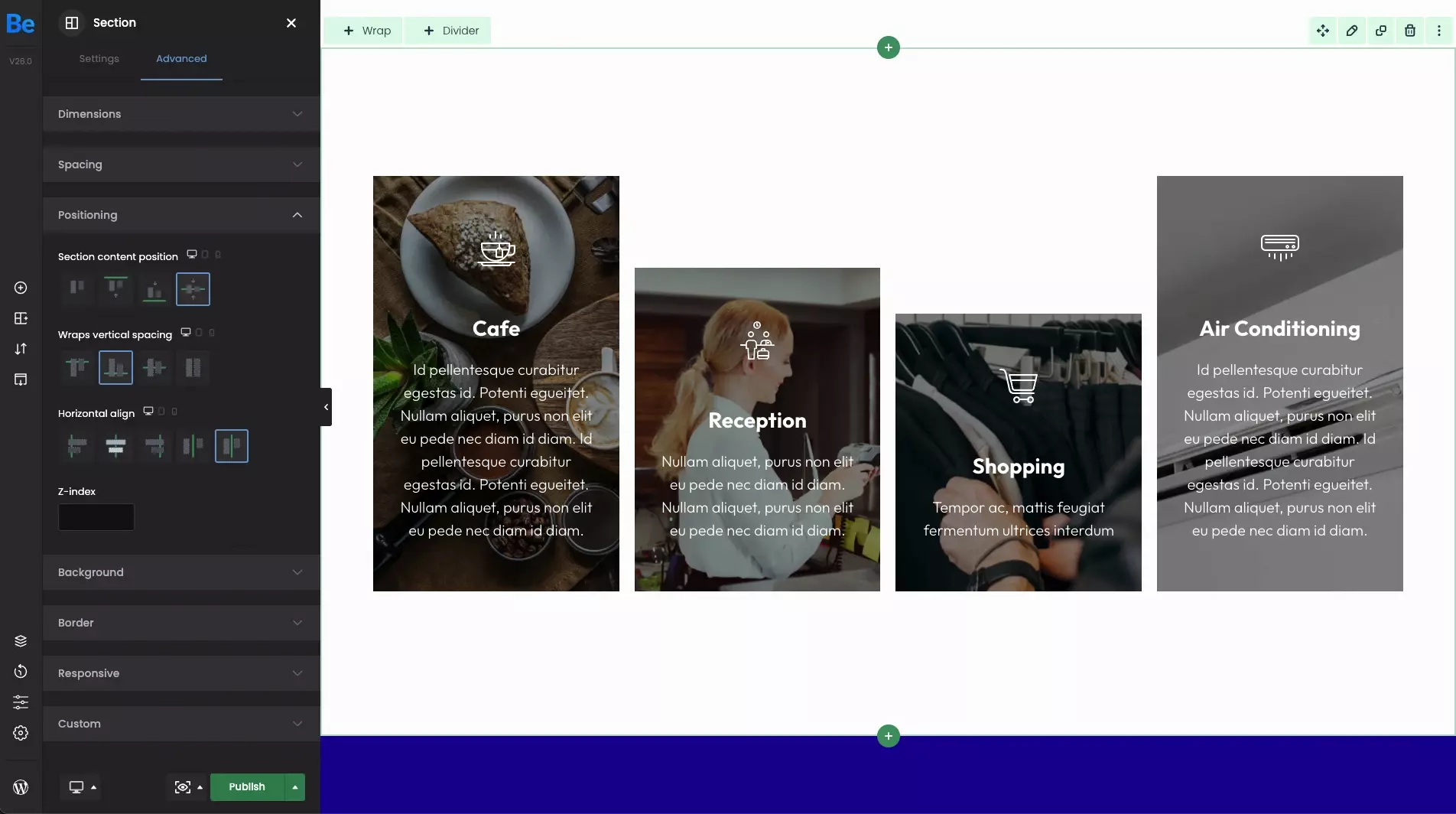
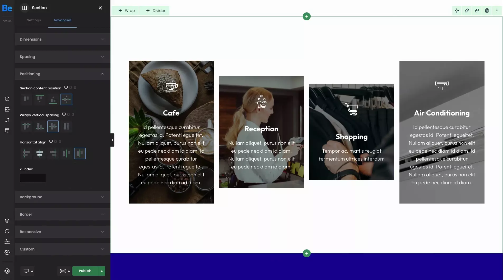
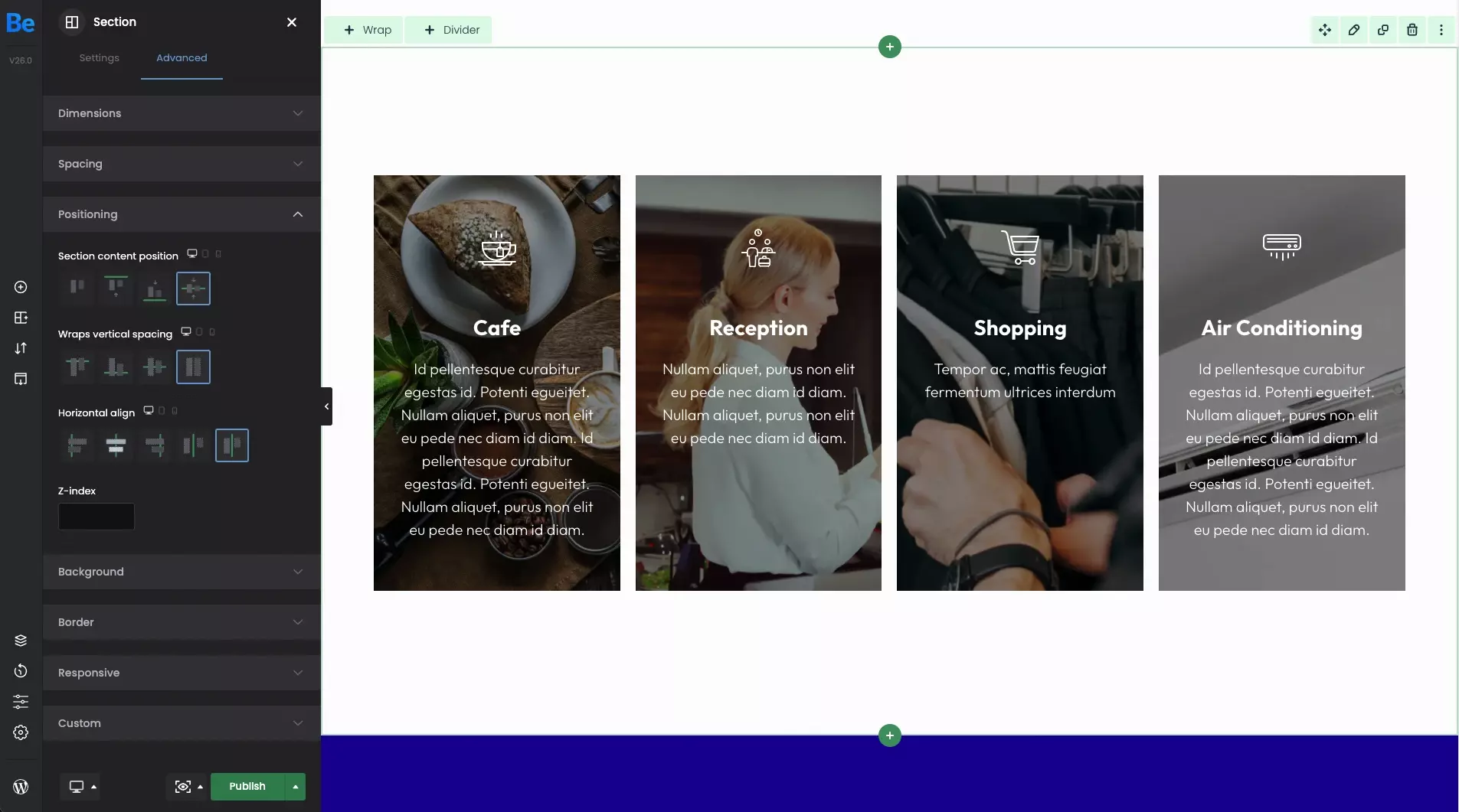
Wraps vertical spacing
If for some reason you need to align the wraps in the section with respect to each other, you can do it with this option easily. This option is especially useful when the wraps height is different.
- Top By using this option, the content in the wraps will be aligned to the top.
- Bottom By using this option, the content in the wraps will be aligned to the bottom.
- Center By using this option, the content in the wraps will be aligned vertically with respect to each other.
- Stretch By using this option, the content in the wraps will be strcthed so that they are all equal, of the same height .
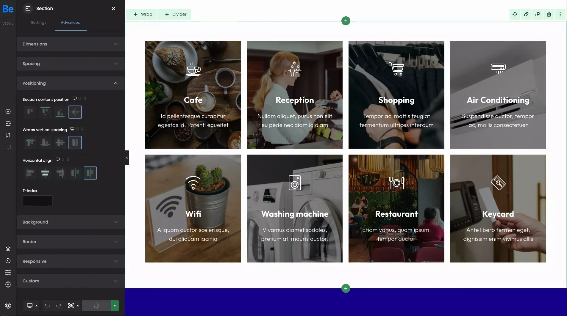
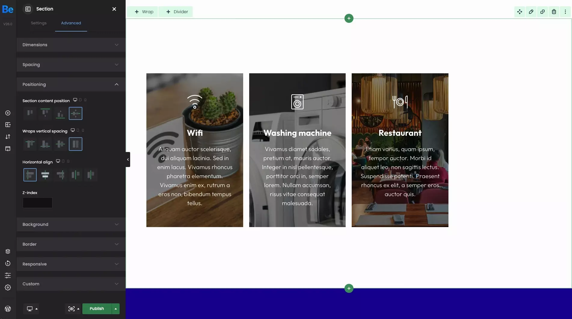
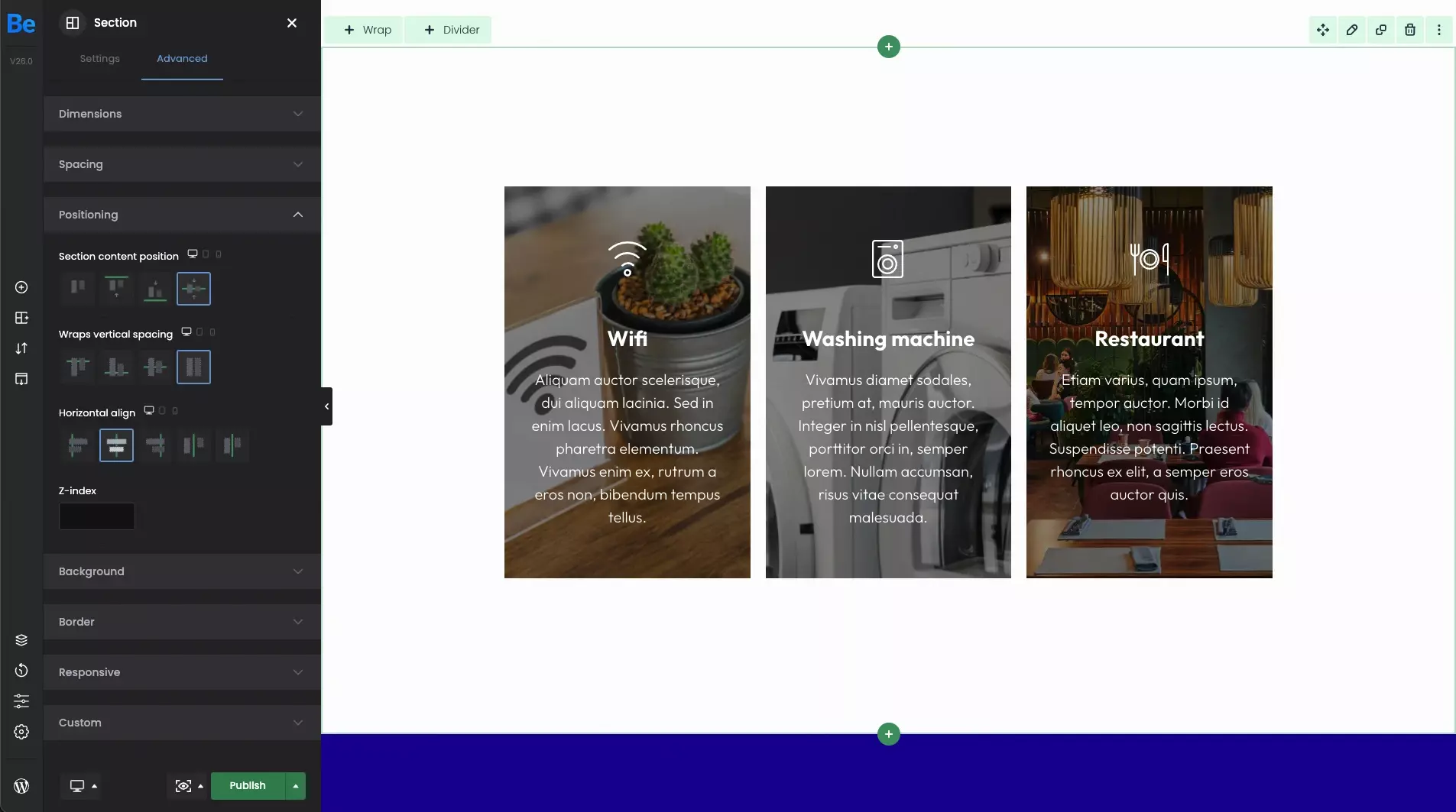
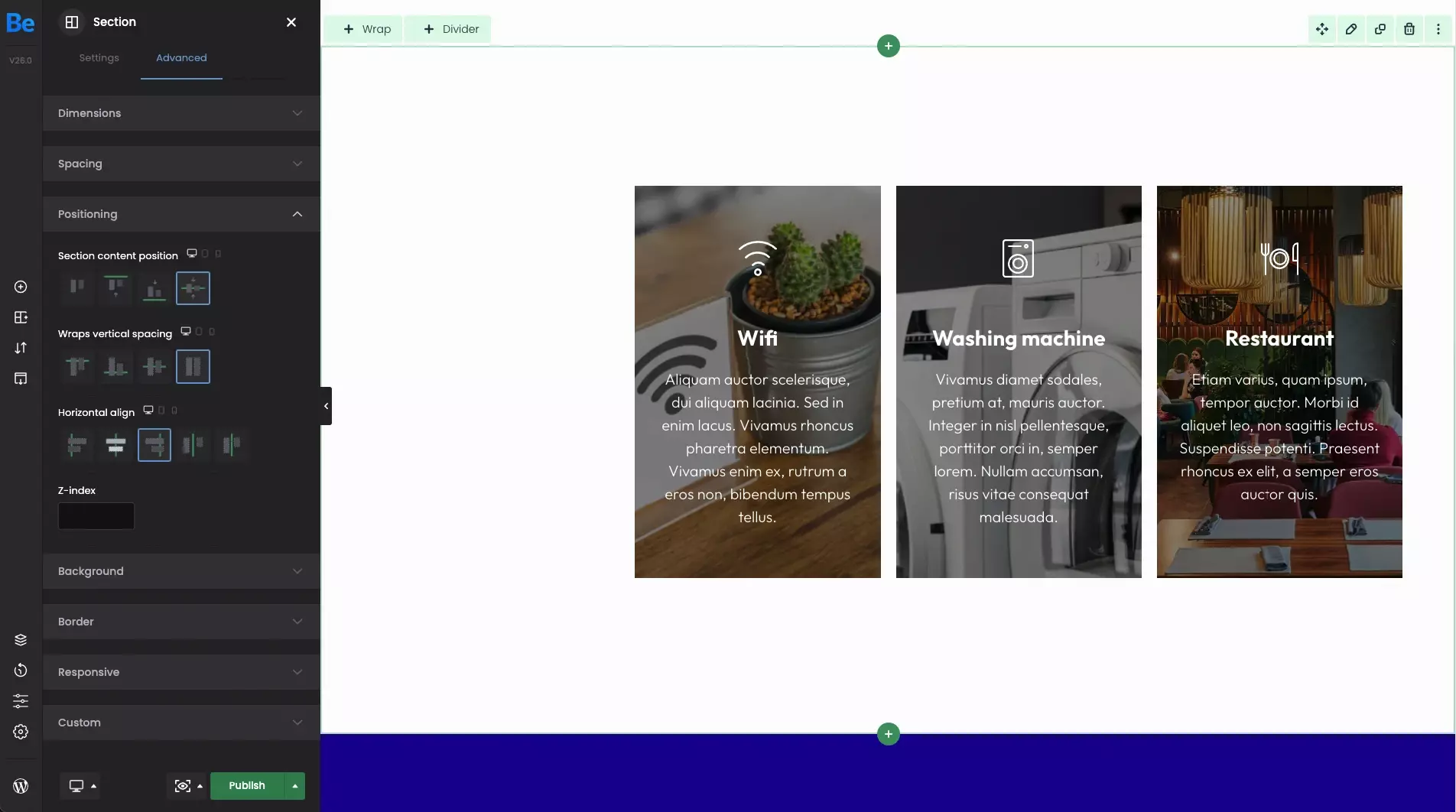
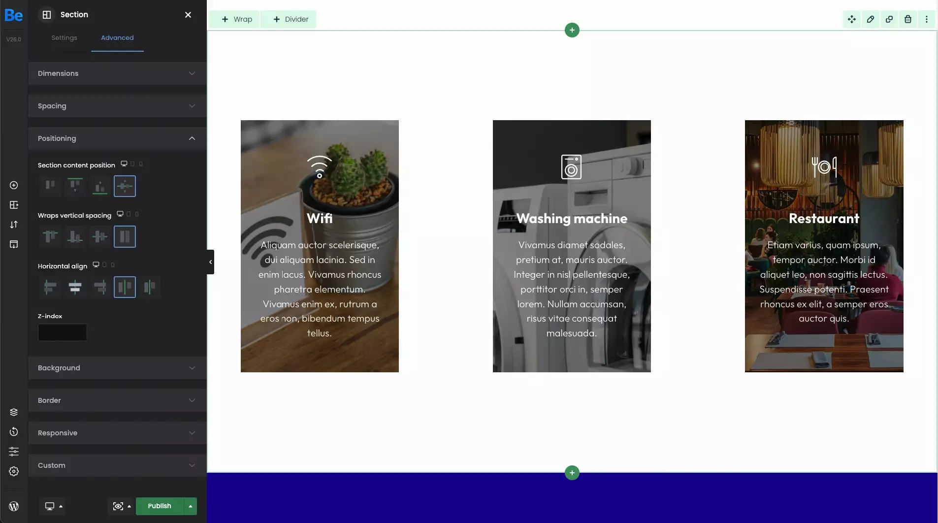
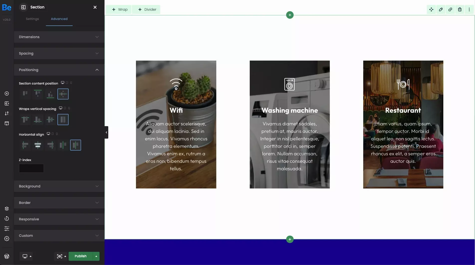
Horizontal align
Within this option, it is possible to align wraps horizontally. Please note that space is required to manage wraps alignment. For example, if you have 2 x 1/2 or 3 x 1/3 elements, there would be no space to move wraps horizontally. Let's go through the examples below to better illustrate the situation.
- Left When this option is set, all wraps will be aligned to the left.
- Center When this option is set, all wraps will be centered.
- Right By using this option, wraps will be aligned to right.
- Space between By using this option, horizontal space between each wrap will be exactly the same.
- Space around By using this option, horizontal space around each wrap will be exactly the same. Compared to the previous option, in this case, the distance between the wraps will be exactly the same as from the edge of the page to outermost wraps.
Wrap
In this part, we will focus on the positioning options for individual wraps and their content.
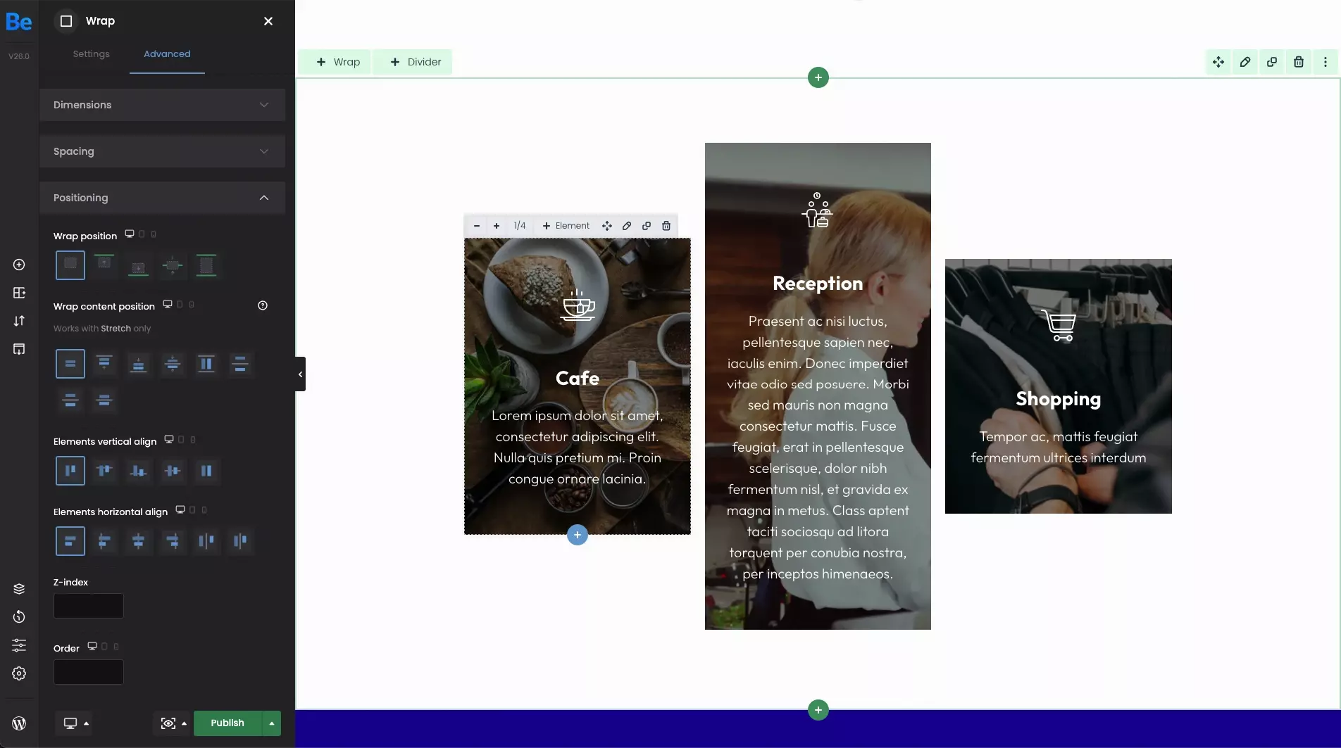
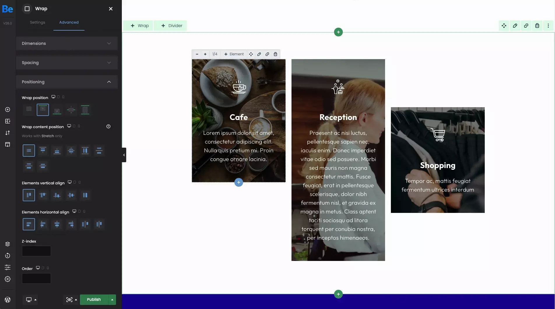
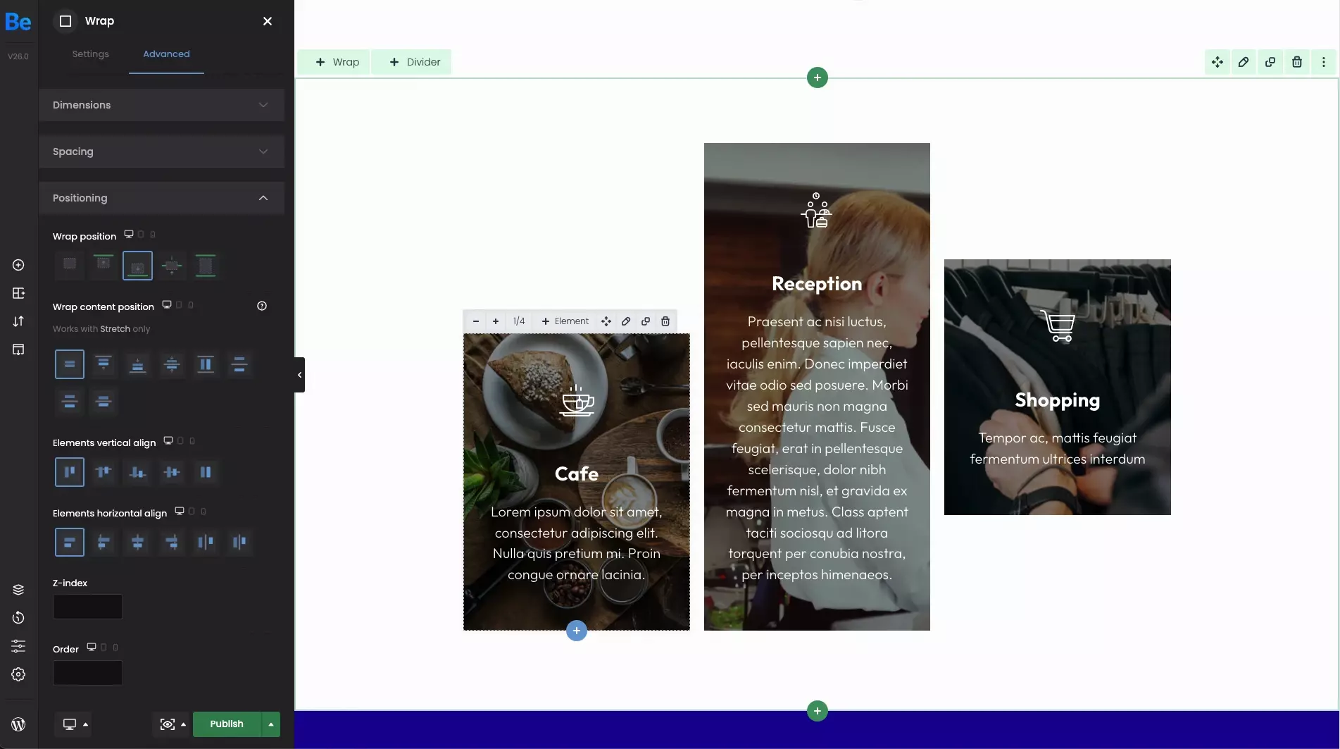
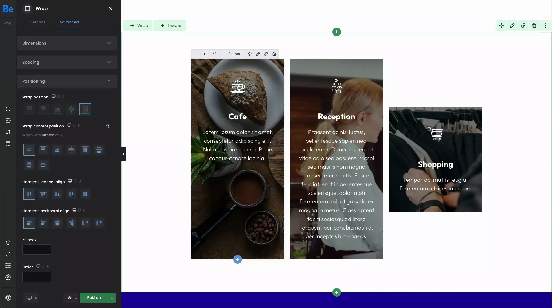
Wrap position
Let's say, we have 3 wraps where content inside each is of a different size. For better explanation, we aligned wraps in section horizontally by default. While explaining the various options, we will focus on positioning the first wrap with "Cafe" title.
- DefaultBy setting the default option, a single wrap will follow what was set for the section. Hence the horizontal alignment of all wraps mentioned above.
- TopWhen this option is set, only the first wrap will be aligned with the top edge of the topmost wrap.
- BottomBy setting this option, the first wrap will be aligned with the bottom edge of the topmost wrap.
- CenterWhen this one is set, the first wrap will be aligned horizontally of the topmost wrap.
- StretchBy setting this option, the first wrap will be stretched to the height of the highest wrap.
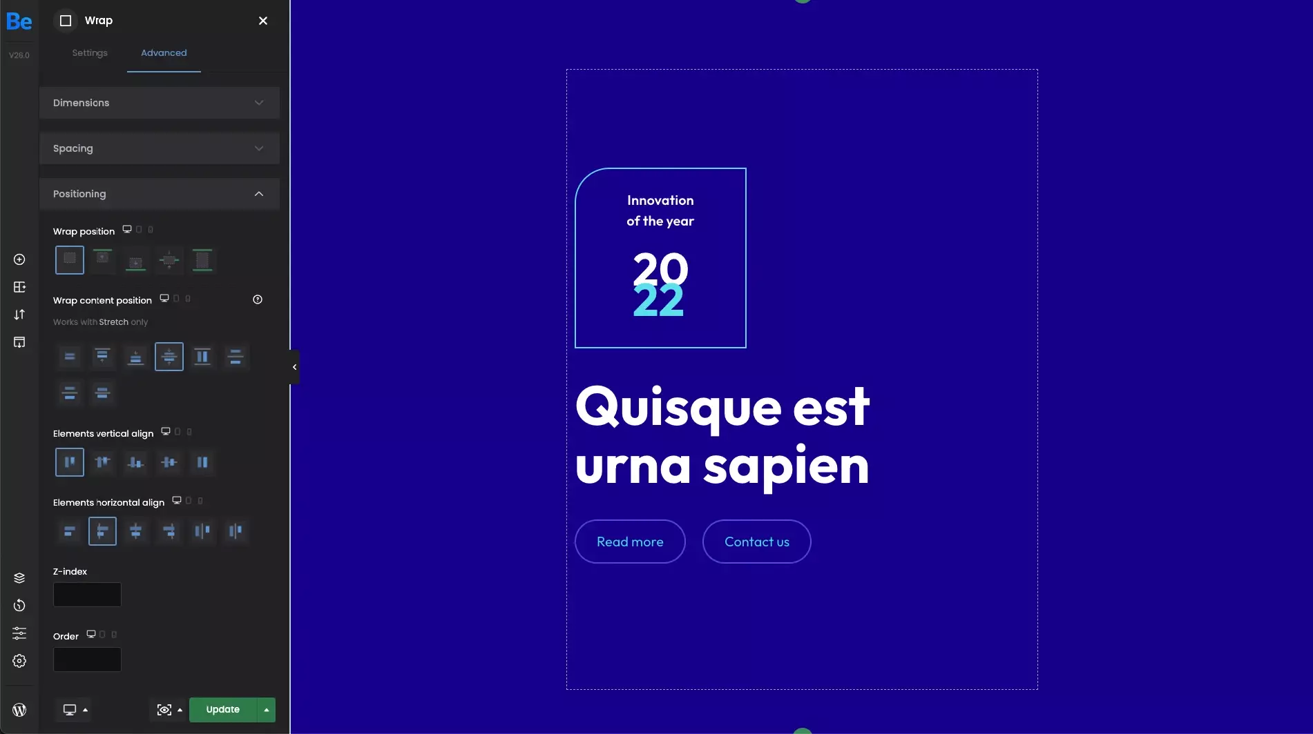
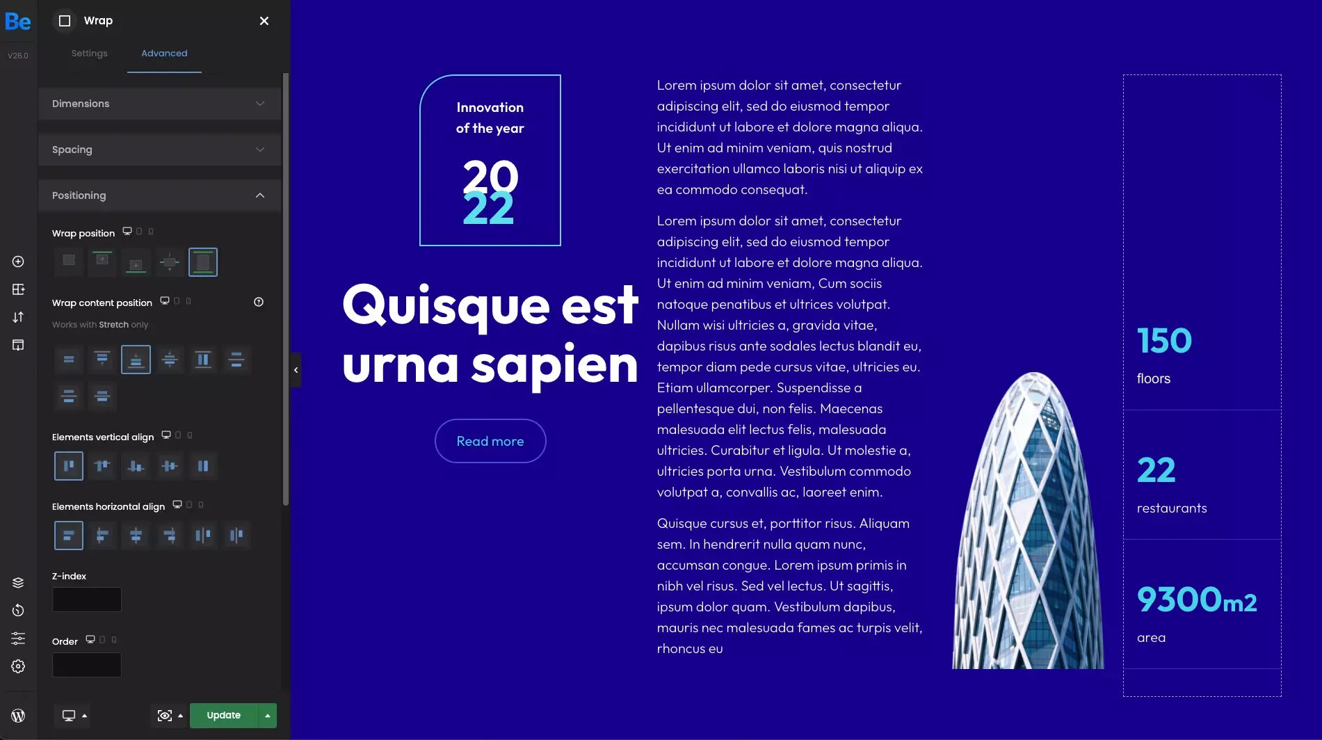
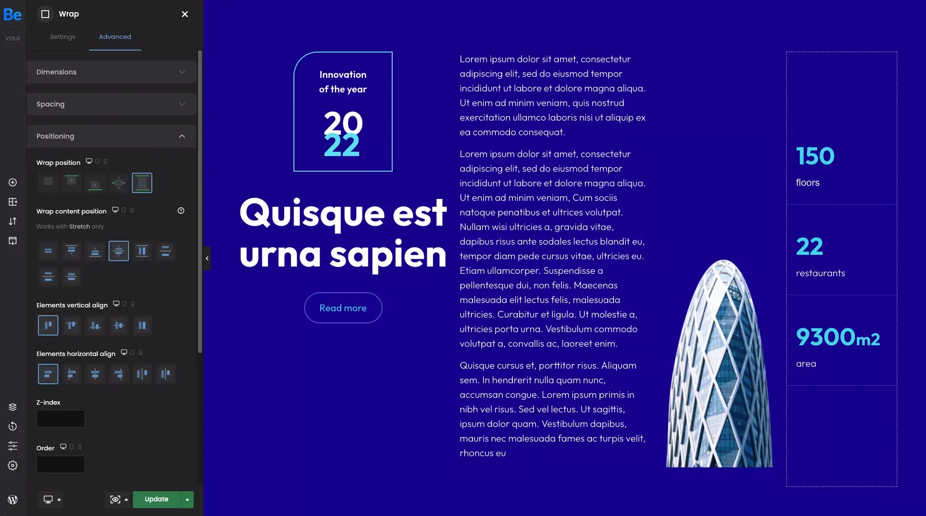
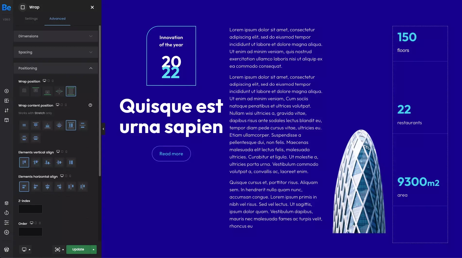
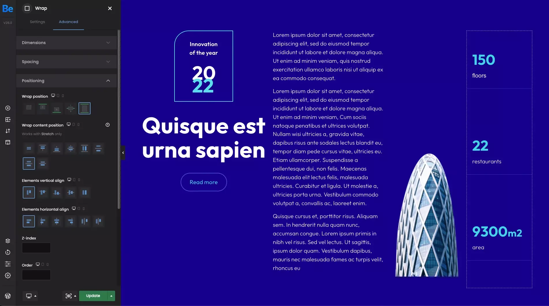
Wrap content position
Within the set of these options, you can position the content inside wraps. But please note that these options works with Stretch only. In this case, we will focus on the 3rd wrap which contains 3 counters.
- TopBy setting this option, the content will be aligned from the very top edge of the wrapper.
- BottomBy setting this option, the content will be aligned from the very bottom edge of the wrapper.
- CenterBy setting this option, the content will be centered horizontally.
- StretchWhen this option is set, the content will fill the entire wrap.
- Space betweenWhen this option is set, elements are evenly distributed in the line. First element is on the start line but the last one on the end line.
- Space aroundWhen this option is set, elements are evenly distributed in the line with equal space around them. Note that visually the spaces aren't equal, since all the elements have equal space on both sides. The first item will have one unit of space against the wrap edge, but two units of space between the next element because that next item has its own spacing that applies.
- Space evenlyWhen this option is set, elements are distributed so that the spacing between any two elements (and the space to the edges) is equal.


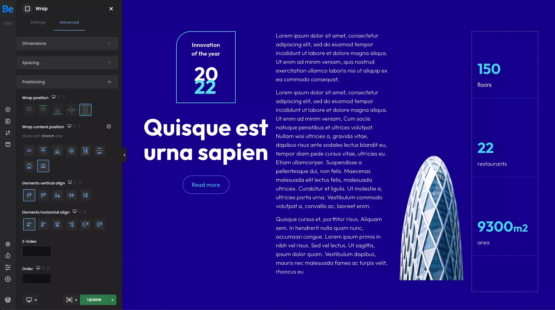
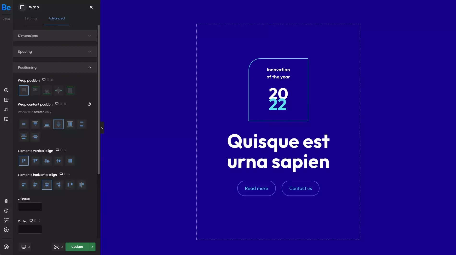
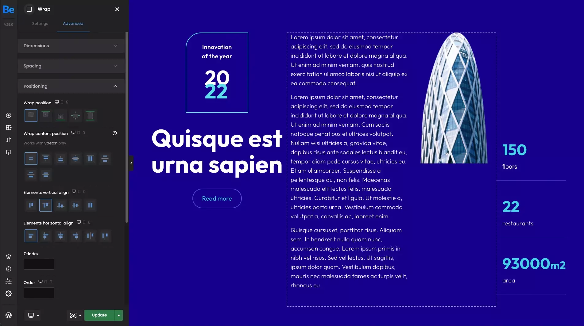
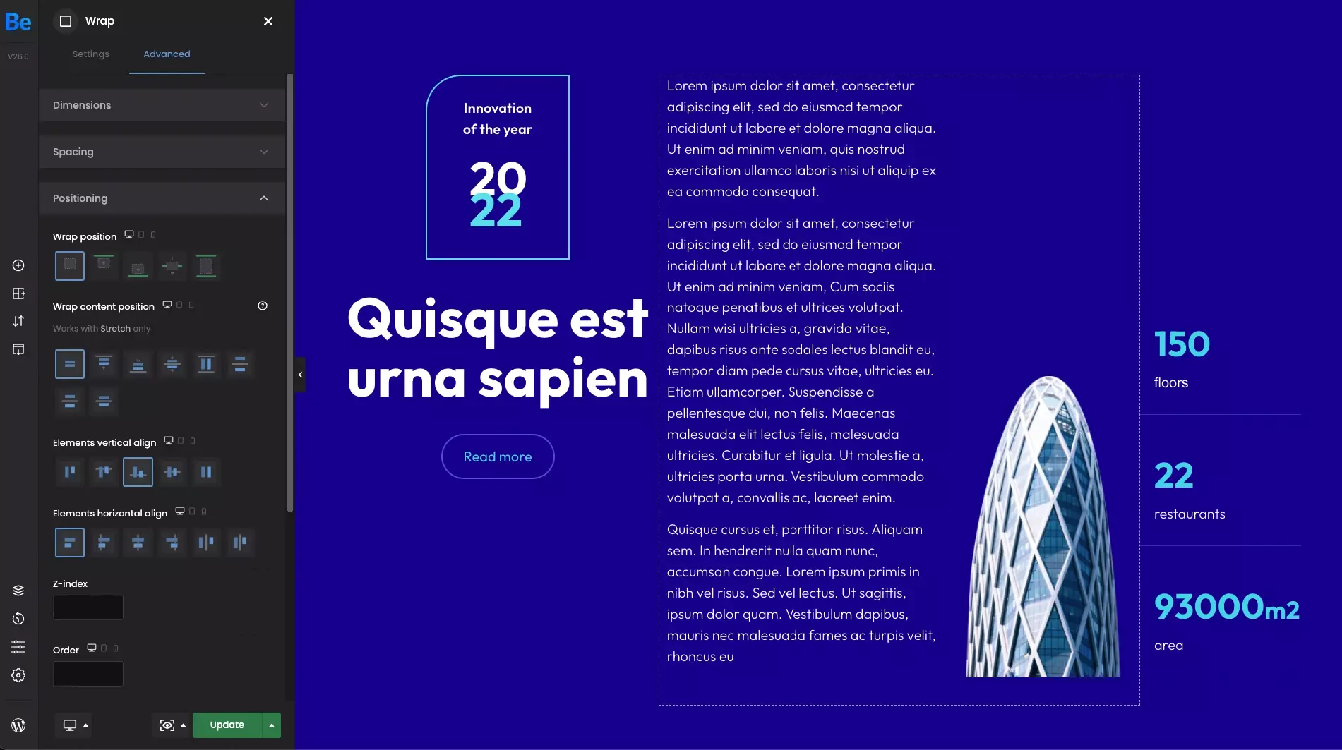
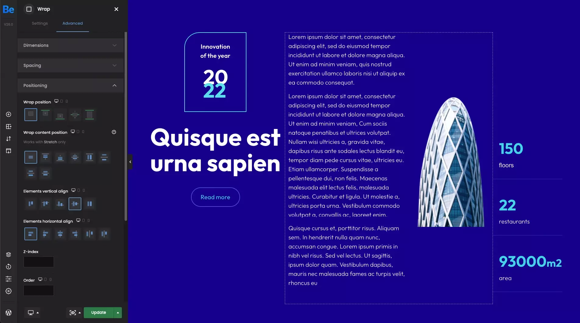
Elements vertical align
To demonstrate the possibilities of these options, we will need wrap with 2 elements inside. In our case, it's gonna be the middle wrap with some text on the left and the image on the right. So let's take a closer look at the options below.
- TopBy setting this option, the content inside will be aligned from the very top edge of the wrap.
- BottomBy setting this option, the content inside will be aligned from the very bottom edge of the wrap.
- CenterBy setting this option, the content inside will be centered horizontally.
- StretchWhen this option is set, the content inside will fill the entire wrap.
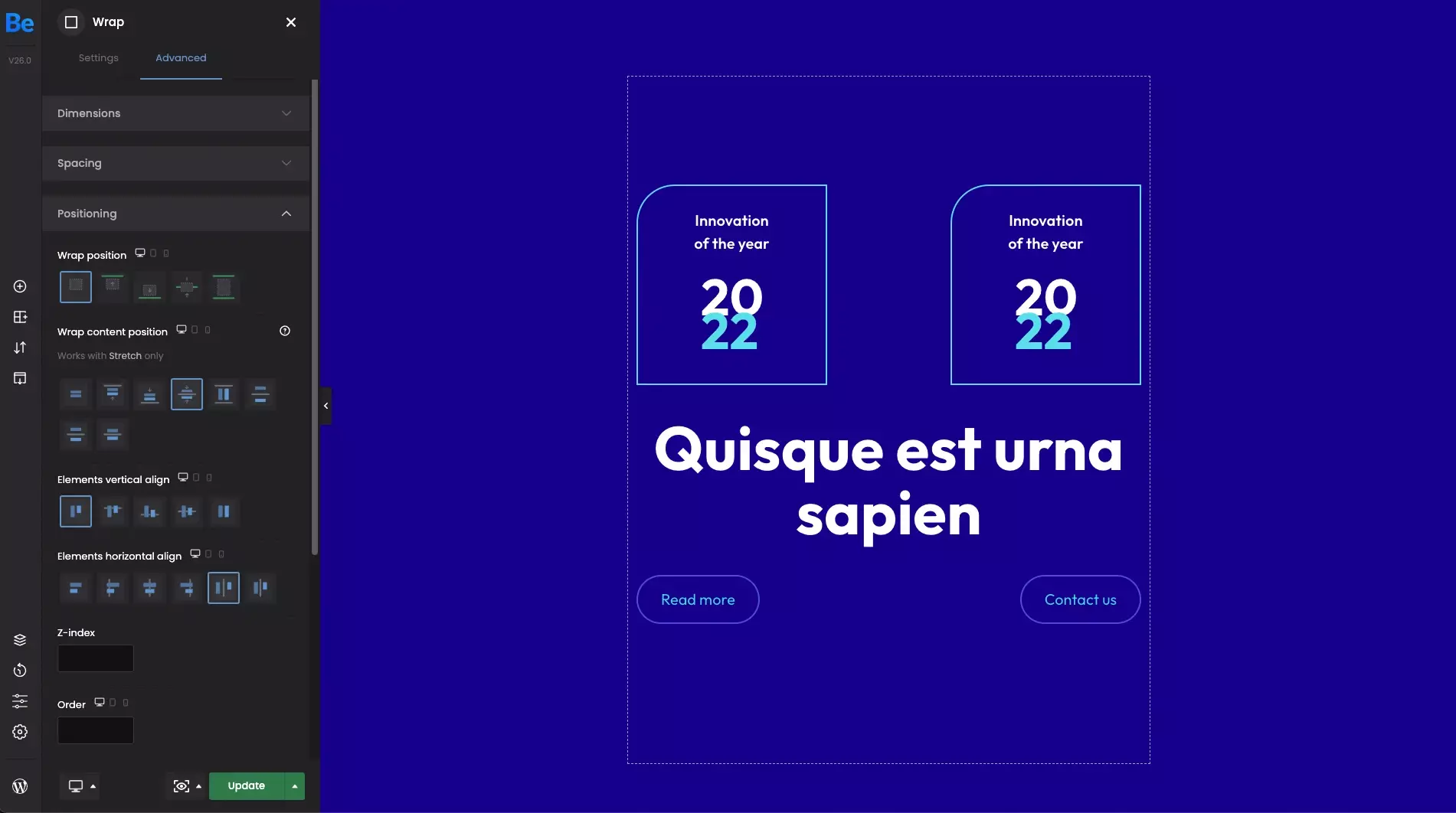
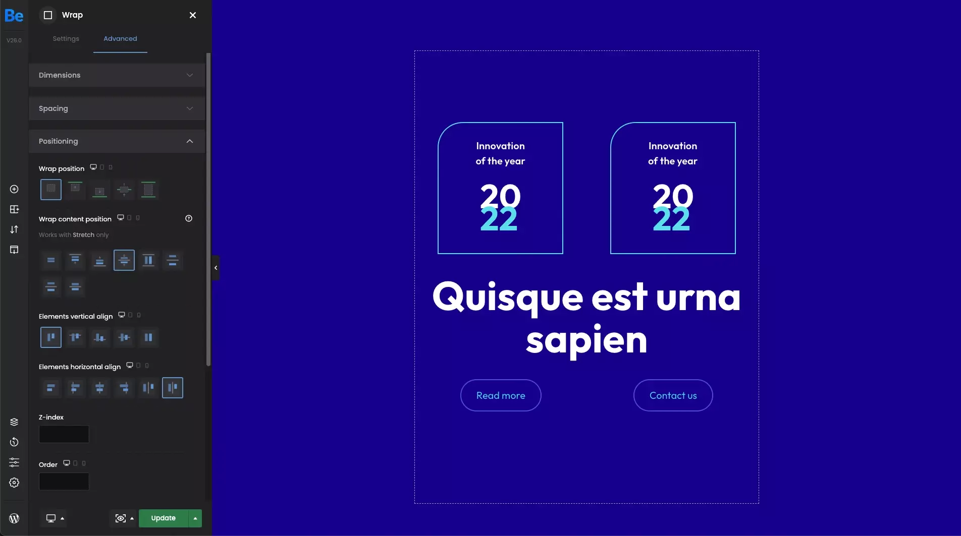
Elements horizontal align
This set of options allows you to align the content of the wrap horizontally. For a closer look at these options, we have created wrap with few elements inside.
- LeftBy setting this option, the content inside the wrap will be aligned to the left edge.
- CenterBy setting this option, the content inside the wrap will be centered horizontally.
- RightBy setting this option, the content inside the wrap will be aligned to the right edge.
- Space betweenUsing this option will make sense only when we have at least 2 elements next to each other on the same line. When set, elements are evenly distributed in the line. First element is on the start line but the last one on the end line.
- Space aroundUsing this option will also make sense only when we have at least 2 elements next to each other on the same line. When set, elements are evenly distributed in the line with equal space around them. Note that visually the spaces aren't equal, since all the elements have equal space on both sides. The first element will have one unit of space against the wrap edge, but two units of space between the next element because that next element has its own spacing that applies.