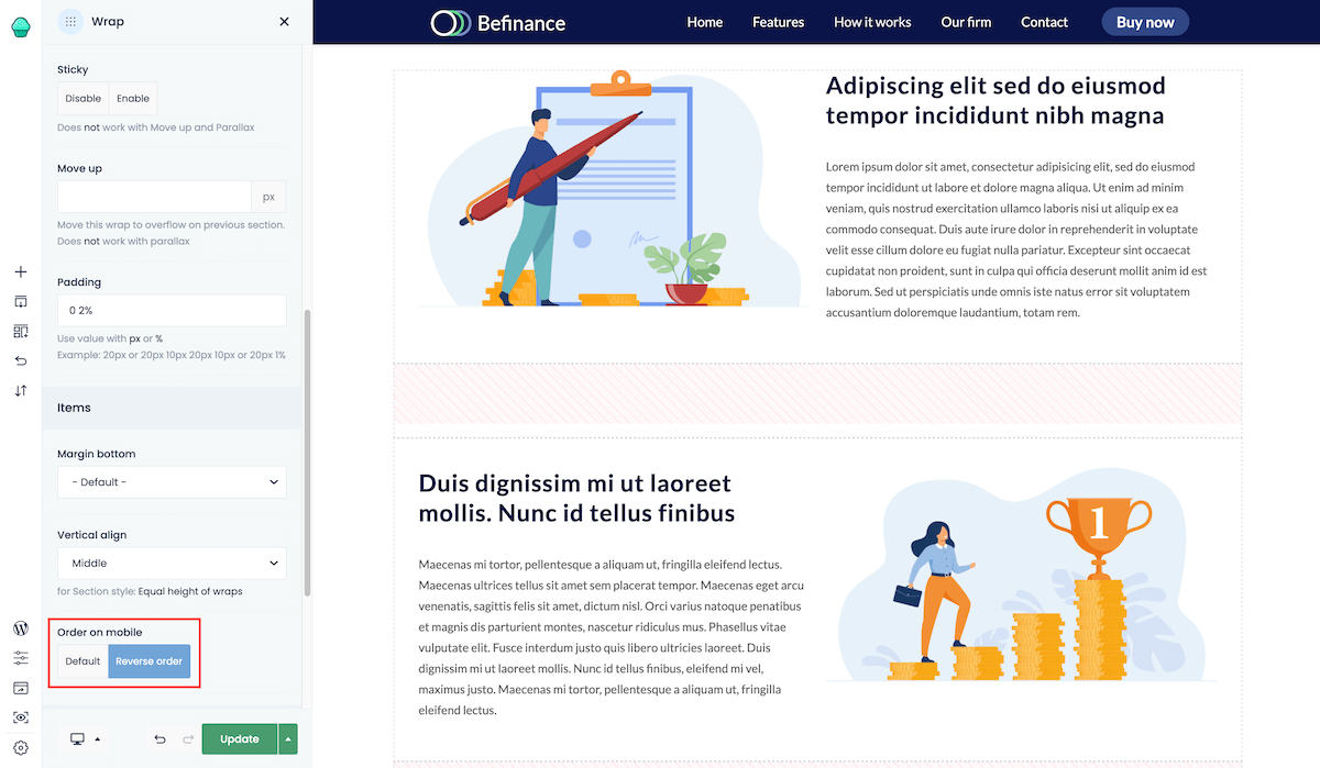
How to reverse the order of elements on mobile?
Whenever you want to reverse the order of elements in same Wrap on mobile, the Order on mobile option comes in handy. For example, let us give the situation where on desktop, we have the layout where in first row is image on the left and text on right, but in second row text on the left and image on the right. While it looks great on desktop, it doesn't on mobile because content on the mobile is loaded by rows, from left to right always. Therefore, in such scenario, you will get the following order: image -> text -> text -> image
This is where the above-mentioned option comes in handy. To display both rows in same order on mobile (first a picture, then a text), for the 2nd row you have to enable Reverse order option. It's that simple!
